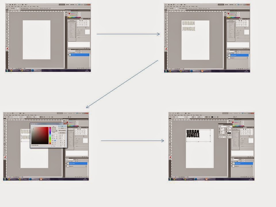
Names for Magazine
- Urban Jungle
- Ignition
- Urban
- Base Jungle
- R n Blues
- Vine
- R N BEE
- Ghetto
- Urban Ignition
- Urban flame
- Black Ghetto
- Flame
- UJ
- NMM (new music magazine)
- MIH (music in the hood)
- Fresh Beats
Artists to Include
- R kelly
- Usher
- Beyonce
- Chris Brown
- Nelly
- Kid Ink
- Rihanna
- Trey Songz
- Mariah Carey
- Drake
- Kanye West
- Kendrick Lamar
- Juicy J
When selecting the model to use for my magazine i will choose a black male as when researching in to the genre i found that most r n b magazines featured a black artist as it portrays the ‘ghetto’ look better as we associate black males to be ‘gangsters’ and connote negative behaviour. If I can't find a black male then I will use a white model. The model will be aged between 18-25 as I need an adult because a child would not be suitable for this genre. The stereotypical model would make you expect to see a young adult fairly big built as this is what the ‘gangster look’ portrays. You would also expect him to have a lot of tattoos as these are associated with people who often behave quite negatively, they are often stereotyped to be quite confident and often seen as outgoing and a ‘player’. If my model doesn't have tattoo’s then i will look on youtube on ‘how to add tattoo’s using photoshop’ and add them to the model. I will also use photoshop to edit the levels to enhance the photo and make it look sharper and more professional. His costume will be quite formal as they are not stereotyped to wear joggers and a t shirt as this wouldn't be suitable, a tracksuit is more associated with rap, he will wear smart trousers and a shirt, it will be undone so you can see his chest and therefore the tattoos, by him having his shirt undone this connotes the idea that he's quite a relaxed chilled back person and doesn't seem to need to impress anyone. i will then get him to have a fur coat sat round his shoulders as this is associated with the ‘pimp’ look, he will also wear a top hat and have a stick/pole in his hand as this also reflects the ‘pimp’ look and reinforces the idea of him being a gangster/pimp. He will also wear a lot of big jewellery such as a watch and a chain.
Character Placement
I will use a Long shot and i will make sure my models eyes are focusing on the audience, he will be looking directly at the camera so the audience can ‘interact’ will him more as the focus of eye contact makes them engage more and therefore be drawn towards the magazine, if eye contact wasn’t there the audience wouldn't be that bothered and wouldn't be as engaged. The model will be sat down therefore showing that even though he isn't at his full height he still gains power over women.
The location of my model will be in the green room at college, i will use this as you can then alter the lighting and also choose any back drop you want, i will use a dark brick effect as the bricks connote cold and negative moods. Also by using the colour grey it represents mystery and anticipation which is what the model would be trying to get women to feel like, he would want them to feel like he’s in control and that they have no control over him. They would therefore want to see the mysterious side to him and understand how he has so much power over them.
I will use a Mid Shot for my photo as this therefore allows the audience to see most of the model, he is still hiding some of his body but allows the audience to relate to him, a mid shot is also used on most magazines and so therefore makes my magazine follow the conventions of a magazine.