Saturday, 27 December 2014

Audience Expectations

Sell lines, call outs and puffs - These are the key aspects to an RnB magazine, this is because it is one of the first things that the buyer is drawn to when sighting the magazine on a shop shelf, etc. This is particularly popular with my target audience as even the slightest bit of information surrounding famous celebrities would draw them in instantly, as my audience is aimed at the younger generation who are attracted to the latest gossip etc. For example: 'Win a FREE Chris Brown CD!' would attract the specific audience to the magazine because it is showing the readers that they can win something from purchasing this magazine. Also, Chris Brown's area within the pop industry is significantly high and is a very popular artist to the younger generation (especially teenage girls) so if they see that he is featured in the magazine then they are more likely to purchase it as he maybe a e.g. Teenage celebrity crush. This would conclude as the overall selling point. 
RnB magazines usually like to use celebrities hobbies as their articles, so there could also be an attractive call-out which may read 'Rihanna's top ten must-haves' which could be presented in a bright, bold luminous colour. This would draw the reader in because they are discovering celebrities hidden secrets etc, which would persuade them to purchase the magazine at an even higher extent, particularly because Rihanna is one of the most influencial, famous pop artists of the 21st Century. This, and also that the title is presented bright etc. so it will catch the readers eyes instantly as it stands out from the background due to the wrtitng being a different colour to the box colour. 
RnB magazines also tend to use specific RnB artists as their main storylines, to promote their magazine. An example of this could be from a sell line which reads ‘USHER FANS! Usher’s newsingle Boyfriend is out now!’ that would make the readers (and Usher fans especially) feel instantly involved, therefore convincing them to purchase the magazine as the topic relates to them the most and have even used their specific name  in the magazine to promote this and attract them to it as it is who they are known as.
There could also be a sell line which reads ‘Katy Perry: I have a huge crush on Will.I.Am!”. This makes the reader feel like they are getting really good/juicy gossip by placing the words ‘huge’ and ‘crush’ together, which suggests to the reader that this is a big deal and then feel like they need/want to know the full story, therefore forcing them to buy the magazine, so it is almost as if the magazine has done this on purpose.
Mast Head - The masthead of an RnB magazine has a huge impact in attracting and addressing my audience, specifically if they are presented large, in capitals or bold writing and clear for everyone to see. These are the first things that the audience sight eye-contact with and will see when purchasing or looking at the magazine as it is the largest, displayed item on the page so it will draw the reader in well. The title of the front cover should be the biggest and boldest as it stands out from all the other features. To have the title as the largest font is important as the readers need to know what the magazine is called for future reference and to make sure that they are buying the correct magazine. You could attract the audience through a title such as: ‘We love RnB’ as it means the reader can immediately understand that it is an RnB magazine and relates to all of their favourite RnB artists within this genre. This a key concept to attracting my audience as it allows them to know that this magazine holds literally all of the information which is related to their favourite music genre that they could want to fufill. 
Mast Heads with the Double Page Spread - Mastheads can be used for the double page spread in an RnB magazine which would help to attract the reader as it is a pull quote and is written in direct quotations. This immediately gives the reader some information about the article before the readers actually read it themselves and tells them that it is for example: an interview. This is also useful so that the reader can sense whether the specfic article which is promoted is within their interest. By using different colours in the title it adds a big attraction for the audience and makes the page look more interesting and thought-provoked. An example of a title used for a contents page could be: ‘What’s inside...’ which is eye-catching and attracting for the audience not only because of the big writing and bright colours but also because it includes an ellipsis. This effectively makes the reader move onto the further features of the page whereas if it didn’t have it they would generally just skip the page.

Saturday, 13 December 2014

Inspiration


Inspiration for my Contents Page from the magazine XXL 


Inspiration for my double page spread from the magazine XXL 


Inspiration for my front cover from the magazine XXL 


Thursday, 6 November 2014

The design of my masthead


These are some designs of font I tried, I used several different websites to help me do this and I tried to choose fonts i thought was most suitable for my genre. I first used a website called dafont.com, I used this to try because it is a well known popular website however you could not copy ad paste the fonts you had to print screen and then paste and crop them, this then led to problems of removing the background thoroughly so I tried a different website.


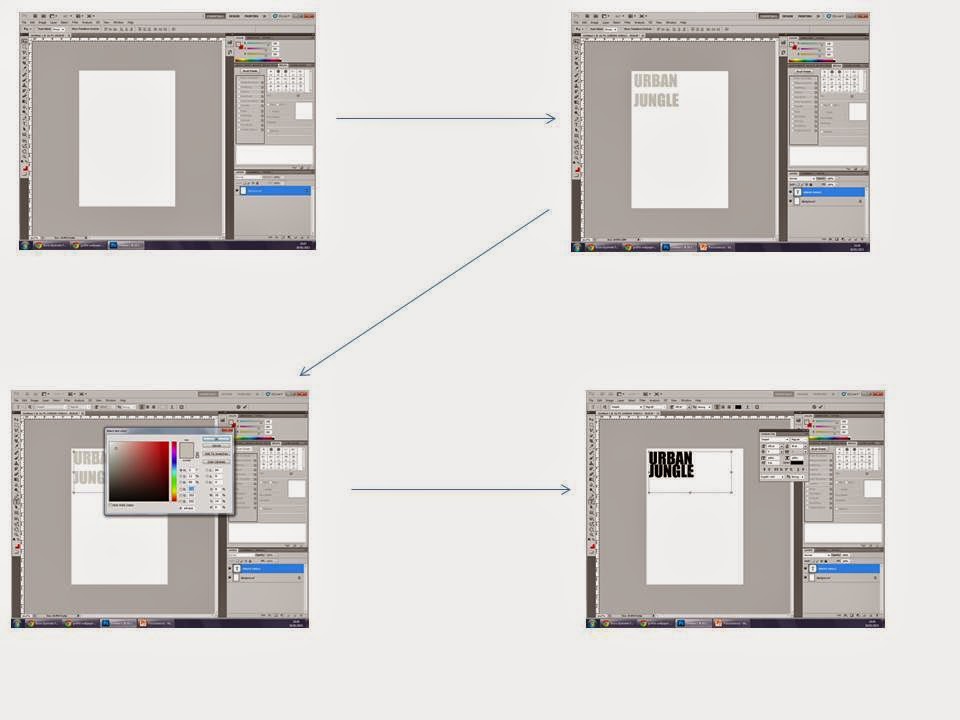
These are then screenshots of how I designed my second masthead:


I then used a website called www.logomaker.co.uk. This allowed me to choose which font I wanted and was able to change the colours and also add an image, I chose to use a monkey as this relates to the name 'Jungle'. I also researched in to existing mastheads and looked at what worked best. After trying out different designs I liked the idea of using a font called 'destroyed' as this made it looked smashed and broken and gave it a quirky effect. I also liked the idea of using the monkey as a logo as this worked well with the name. Below are some ideas I did when testing out different mastheads. I changed the animal and also tried different colours.


However then after adding it to my magazine and changing it around, I asked several people if there was anything they'd change and after taking this in to consideration I came up with some new ideas for mastheads by changing colours and fonts and abbreviating the words to just the letters of 'UJ' I then asked several people which one they preferred and the most popular one was this one:

I therefore will use this as my final masthead instead of the original, as I want people to like the masthead as this is the main selling point. If the audience's attention isn't drawn to the masthead then they aren't going to want to pick up the magazine again and again as the masthead stays the same throughout each edition.
I based my ideas for this final masthead on a current selling magazine named XXL below is an image of their masthead, they are a very successful magazine and even with a simple masthead it is still effective and you know the brand of the magazine instantly.


Name,Artists, Location,Costume, Character placement

Names for Magazine 
- Urban Jungle 
- Ignition 
- Urban 
- Base Jungle
- R n Blues 
- Vine 
- R N BEE
- Ghetto
- Urban Ignition
- Urban flame
- Black Ghetto 
- Flame 
- UJ
- NMM (new music magazine) 
- MIH (music in the hood)
- Fresh Beats

Artists to Include
- R kelly 
- Usher 
- Beyonce
- Chris Brown 
- Nelly
- Kid Ink
- Rihanna
- Trey Songz
- Mariah Carey
- Drake
- Kanye West
- Kendrick Lamar
- Juicy J 

When selecting the model to use for my magazine i will choose a black male as when researching in to the genre i found that most r n b magazines featured a black artist as it portrays the ‘ghetto’ look better as we associate black males to be ‘gangsters’ and connote negative behaviour. If I can't find a black male then I will use a white model. The model will be aged between 18-25 as I need an adult because a child would not be suitable for this genre. The stereotypical model would make you expect to see a young adult fairly big built as this is what the ‘gangster look’ portrays. You would also expect him to have a lot of tattoos as these are associated with people who often behave quite negatively, they are often stereotyped to be quite confident and often seen as outgoing and a ‘player’. If my model doesn't have tattoo’s then i will look on youtube on ‘how to add tattoo’s using photoshop’ and add them to the model. I will also use photoshop to edit the levels to enhance the photo and make it look sharper and more professional. His costume will be quite formal as they are not stereotyped to wear joggers and a t shirt as this wouldn't be suitable, a tracksuit is more associated with rap, he will wear smart trousers and a shirt, it will be undone so you can see his chest and therefore the tattoos, by him having his shirt undone this connotes the idea that he's quite a relaxed chilled back person and doesn't seem to need to impress anyone. i will then get him to have a fur coat sat round his shoulders as this is associated with the ‘pimp’ look, he will also wear a top hat and have a stick/pole in his hand as this also reflects the ‘pimp’ look and reinforces the idea of him being a gangster/pimp. He will also wear a lot of big jewellery such as a watch and a chain. 

Character Placement 
I will use a Long shot and i will make sure my models eyes are focusing on the audience, he will be looking directly at the camera so the audience can ‘interact’ will him more as the focus of eye contact makes them engage more and therefore be drawn towards the magazine, if eye contact wasn’t there the audience wouldn't be that bothered and wouldn't be as engaged. The model will be sat down therefore showing that even though he isn't at his full height he still gains power over women. 
The location of my model will be in the green room at college, i will use this as you can then alter the lighting and also choose any back drop you want, i will use a dark brick effect as the bricks connote cold and negative moods. Also by using the colour grey it represents mystery and anticipation which is what the model would be trying to get women to feel like, he would want them to feel like he’s in control and that they have no control over him. They would therefore want to see the mysterious side to him and understand how he has so much power over them. 

I will use a Mid Shot for my photo as this therefore allows the audience to see most of the model, he is still hiding some of his body but allows the audience to relate to him, a mid shot is also used on most magazines and so therefore makes my magazine follow the conventions of a magazine.