Saturday, 27 December 2014

RnB magazine analysis - double page spread

This is a double page spread taken from the music magazine ‘Q’, who are advertising the Black Eyed Peas, one of R&B’s most iconic music groups.
Immediately, the image will draw the reader’s attention because it takes up two thirds of the entire two pages. The organisation of the features such as the column of writing is clear to see, as well as the writing, because it isn’t too large and doesn’t take up a vast quantity so it therefore allows for more written information to be put into the column, and the black coloured font is also a contrast of the white background and hence helps to stand out to the reader, attracting their attention. This is so that when they read the article, the simple type of font makes it even easier to read. The affect overall is that the audience will feel more comfortable when reading the article, as there are less complications involved than there would be without the contrasting colours and simple fonts, etc. and hence this will reel in the audience to read this article.
A disadvantage to this article wouble be that the image crosses over the fold of the page and the image is cut off and cannot be fully viewed by the audience, and this can put off the audience as they prefer to see a full image rather than seeing half of an image. The design of putting the image over the centrefold of the page was a poor decision.
The colour scheme on the double page spread is clear to identify with a mix of gold, black and white with other similar colours like beige and light grey, which are located across the page in images, writing and headings and created images. This could signify the bands rich and famous lifestyle, and the colour gold could also have the connotation of the band’s wealth, good health, success and personal power.
The image of the Black Eyed Peas has a different variaty of  colours, with Will.I.Am wearing black, white, beige and grey which contrast and compliment each other at the same time. This gives away a connotation to the reader that will.I.am is more important than the other members. This is because he is standing in front of the other members, whilst the other members stand behind him, slightly faded. He has the most successful solo career out of the entire group, after collaborating with many successful, multi-platinum artists such as Cheryl Cole, Britney Spears, etc. which may further explain this.
The colours certainly stand out as striking and different which will catch the eye of the audience, but these colours also look good together as they make the other colours stand out too, further making the page lively, and ebullent. Also, the white background helps to make the characters stand out as they are wearing strong colours, and the overall effect is that they are the main feature on the page which will draw attention. 
The header and pull quote have a very ‘futuristic’ feel due to the gold and the chrome colours. These colours contrast massively with the plain white text box that caresses it. Also, the pull quote has a highly robotic appearance and further reflects the futuristic look. The plain white background gives the page a simplistic and quite ‘empty’ feel, which further adds to the futuristic look on things. However, the plain white background could also be a denotation; the colour white symbolises purity and the Black Eyed Peas’ material is always written and produced by their selves (in particular will.i.am, who is at the front of the feature image) and hence, is ‘pure’ as everything the group sing is true to themselves.
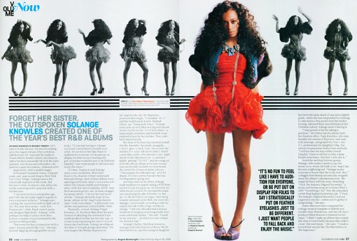


Her posture shows the innocence that she may have with the hand behind her back, but this may also represent a slight confidence. The artists name being in blue draws the reader’s attention to that section, because the name contrasts against the white background and black writing. This is so that the audience will instantly know who this article will be about.
The pictures represented along the top of the double page spread, allows the reader to get an insight into the artists personality, which will put the reader at ease with the artist. It shows the fun, lively, and creative side of the artist, but also a bit of her background on her.
The audience will also be attracted to the artist from the middle, main photograph. This is because the fact she is wearing red, stands out from the black and white colour of the background, which helps her stand out a lot more, catching the reader’s eye instantly. The connotations of the colour red, is romance, love, fire, sexiness all of which may represent her personality. What she is wearing also shows that she is a modern artist because she is fashionable with today’s trends, which will attract a lot of the younger audiences, as she is keeping in with this generation’s style. Most young women like to be up to date with what celebrities are wearing, and the latest trends in the different seasons etc. therefore this also explains to the reader that she is highly professional, and sophisticated by keeping with the right dress styles for certain scenarios.
The fact that there is a section of text in bold, right next to the artists legs, in black writing with a much larger font, helps it stand out more. It is attracting the reader to the main source, and the more important parts of the text. Many of the younger audience maybe attracted to her legs in prone of jealousy, or admiration etc. therefore this text may have also been placed here specifically, because they know that the readers will be looking at the bright photograph first as it catches their eye, rather than going straight into the context. 
The artist is making direct eye contact with the audience, also known as the ‘direct mode of address’, therefore it is drawing attention of the reader, into the article, because it is as if the artist is addressing you personally. This will put the reader at ease with the artist.


RnB magazine analysis - front cover


Target Audience - The target audience for the VIBE magazine would be the people aged between 16 and 30, because they are the people who enjoy this generations R&B artists and music which the magazine advertise and are not affected by the use of explicit material etc. in this type of music and the information in the VIBE magazine itself. Adults and children would not be interested within this boundary of entertainment, as it doesn't fit within their genertaion or time.  For example: Chris Brown, who is promoted as the feature article photograph relates to the 16 - 30 audience, as he is an R&B artist who fits into their generation and age group. Young adults look up to the aspiring pop artists of today as role-models, therefore VIBE are followed by a much younger audience so that the audience can follow in their footsteps, or simply catch up on the latest gossip involving R&B celebrities. Aswell as this, most R&B artists of today are either in their teenage years themselves or just above, so the younger audience can realate to their background etc. as they are of a similar age. 


Mast Head - The mast head begins from the top left, as people begin to read from that side. The font is large and bright, with a luminous white colour so it will be extremly visible and attractive to the reader. The letters which spell out VIBEm is displayed in bubble writing to comprehend with the target audience (younger generation) so that the audience knows that it relates to them. The title is almost entirely covered by one of the top R&B artists 'Chris Brown' because he is a dominant R&B artist and is highly popular internationally, which will attract the reader from a shop window/shelf as it is what the reader will spot first. Both VIBE and Chris Brown mixed together on one cover will attract audiences alike, as they are both well-known and relate to each other.
Price - The price on the VIBE magazine is centred on the barcode, however it is presented small. This is because the company are a popular brand and will not want to attract the reader instantly to the price, if it is too high. It might not meet the expectations of the buyer, therefore VIBE would lose out on a lot of the magazines main/key audience. 
Feature Article Photograph - VIBE immediately clarify that Chris Brown is the main article of the magazine, because he has his own large advertisement (photograph) as the front cover. The reader is informed instantly that Chris Brown is the main topic, because it stands out the most above the rest of the information and images etc. which is given on the front cover. The photograph will attract multiple teenage boys/girls to the image and the magazine, as Chris Brown is known to be highly popular amongst younger audiences with his latest songs and image. This will leave the reader engaged, as their favourite R&B artist is the main article of a a popular magazine, therefore it shows that it must be worth something if an extremely famous artist is presented on the front cover. This will make the reader want to purchase the magazine as Chris Brown is focused as the main protagonist of the front page and the feature article photograph. The photograph would especially attract the teenage girl sector of the audience as he could be, e.g. an idol, or teenage celebrity crush. To contrast with RnB's different artist backgrounds, some weeks, VIBE choose to show R&B women artists as their front cover and others of the men. This explains to the reader that VIBE's main audience isn't based on just one particular gender, as they use both male and female artists each week to please both, and ultimately explains to the reader that their magazines are not gender-biased.
Main Cover Line - The main cover line for the VIBE magazine is the text that reads 'IS THAT CHRIS BROWN?' which will attract the audience almost instantly. This is because Chris Brown is one of the most influencial and famous R&B artists of our generation, therefore VIBE would know that this would make a big impact on their fans sales. The words stand out a great deal, in some-ways it is more noticeable than the Mast Head. The main cover line is presented in the same colour as the Mast head so that they contrast well and do not clash. This could have also been done to explain to the reader that the article/topic involving Chris Brown is as dominant as the VIBE brand and title itself, therefore they choose to present this in the same colour as the title to display it's importance towards the magazine. The words 'CHRIS BROWN' are the overview of what the magazine will contain the most because it is presented as the main article, therefore the audience will know what to expect throughout the majority of the magazine. 
Cover Line - The magazine gives a drop down list of cover lines all the way down the right-hand side of the front cover. An example of one of these would be 'Usher's exes'. This is extra information which is added onto the front cover, so that the reader can grasp a sense of what other storylines/features will be contained throughout the magazine. The word 'Usher' is presented in the colour Green to emphasize that it is to do with a famous celebrity (especially being R&B) and is displayed in this colour so that it stands out against the dark background, as the green is luminous. 
Plugg - An example of a plugg from this magazine would be the quote towards the bottom left corner of the front cover which reads "I'M STILL A VIRGIN IN YOUR EYES..." This is a quote which continues on from the main cover line as it is a quote from Chris Brown related to the previous topic, with the reader being told this from the speech marks at each side and presented right underneath of the main cover line. This quote also features the word 'YOUR', however it is presented in italic writing to stand out and engage the reader to explain that it is involving the audiene in with the topic. The quote ends with an ellipsis, because the whole quote does not explain the full topic and will link to something else later on in the magazine so the reader would have to look inside to find out more, persuading them to purchase the magazine, concluding as the overall selling point.
Puffs - The front cover uses Puffs by using attractive and powerful words, such as: 'Rise', 'Fall', 'Mega', 'Best' and 'Debarge'. This will attract the reader as they make it sound as if VIBE is as dominant as the words and information that is used, which will persuade the reader to purchase the magazine. 
Strapline - The strapline is at the very top of the front cover and explains more about the brand to promote it, by advertising extra information which is included with the magazine. For Example: 'COCAINE, HEROINE, PRISON, HIV... AND THE BEST LOVE SONGS OF THE 80's.' This is used to explain to the reader that there is more storylines, celebrities etc. which the magazine offers. For this issue, the strapline would be most beneficial to those who dislike Chris Brown who is promoted as the main article/photograph, because the reader is informed that there are more storylines and activities etc. that the reader can appreciate. 

Audience Expectations

Sell lines, call outs and puffs - These are the key aspects to an RnB magazine, this is because it is one of the first things that the buyer is drawn to when sighting the magazine on a shop shelf, etc. This is particularly popular with my target audience as even the slightest bit of information surrounding famous celebrities would draw them in instantly, as my audience is aimed at the younger generation who are attracted to the latest gossip etc. For example: 'Win a FREE Chris Brown CD!' would attract the specific audience to the magazine because it is showing the readers that they can win something from purchasing this magazine. Also, Chris Brown's area within the pop industry is significantly high and is a very popular artist to the younger generation (especially teenage girls) so if they see that he is featured in the magazine then they are more likely to purchase it as he maybe a e.g. Teenage celebrity crush. This would conclude as the overall selling point. 
RnB magazines usually like to use celebrities hobbies as their articles, so there could also be an attractive call-out which may read 'Rihanna's top ten must-haves' which could be presented in a bright, bold luminous colour. This would draw the reader in because they are discovering celebrities hidden secrets etc, which would persuade them to purchase the magazine at an even higher extent, particularly because Rihanna is one of the most influencial, famous pop artists of the 21st Century. This, and also that the title is presented bright etc. so it will catch the readers eyes instantly as it stands out from the background due to the wrtitng being a different colour to the box colour. 
RnB magazines also tend to use specific RnB artists as their main storylines, to promote their magazine. An example of this could be from a sell line which reads ‘USHER FANS! Usher’s newsingle Boyfriend is out now!’ that would make the readers (and Usher fans especially) feel instantly involved, therefore convincing them to purchase the magazine as the topic relates to them the most and have even used their specific name  in the magazine to promote this and attract them to it as it is who they are known as.
There could also be a sell line which reads ‘Katy Perry: I have a huge crush on Will.I.Am!”. This makes the reader feel like they are getting really good/juicy gossip by placing the words ‘huge’ and ‘crush’ together, which suggests to the reader that this is a big deal and then feel like they need/want to know the full story, therefore forcing them to buy the magazine, so it is almost as if the magazine has done this on purpose.
Mast Head - The masthead of an RnB magazine has a huge impact in attracting and addressing my audience, specifically if they are presented large, in capitals or bold writing and clear for everyone to see. These are the first things that the audience sight eye-contact with and will see when purchasing or looking at the magazine as it is the largest, displayed item on the page so it will draw the reader in well. The title of the front cover should be the biggest and boldest as it stands out from all the other features. To have the title as the largest font is important as the readers need to know what the magazine is called for future reference and to make sure that they are buying the correct magazine. You could attract the audience through a title such as: ‘We love RnB’ as it means the reader can immediately understand that it is an RnB magazine and relates to all of their favourite RnB artists within this genre. This a key concept to attracting my audience as it allows them to know that this magazine holds literally all of the information which is related to their favourite music genre that they could want to fufill. 
Mast Heads with the Double Page Spread - Mastheads can be used for the double page spread in an RnB magazine which would help to attract the reader as it is a pull quote and is written in direct quotations. This immediately gives the reader some information about the article before the readers actually read it themselves and tells them that it is for example: an interview. This is also useful so that the reader can sense whether the specfic article which is promoted is within their interest. By using different colours in the title it adds a big attraction for the audience and makes the page look more interesting and thought-provoked. An example of a title used for a contents page could be: ‘What’s inside...’ which is eye-catching and attracting for the audience not only because of the big writing and bright colours but also because it includes an ellipsis. This effectively makes the reader move onto the further features of the page whereas if it didn’t have it they would generally just skip the page.

Saturday, 13 December 2014

Inspiration


Inspiration for my Contents Page from the magazine XXL 


Inspiration for my double page spread from the magazine XXL 


Inspiration for my front cover from the magazine XXL